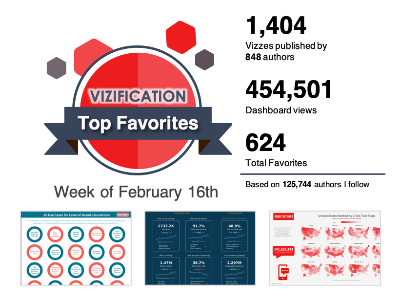
1.) 20 Use Cases for LOD Calculations
by Ken Flerlage
2.) Insight hub
by Emma Cosh
3.) Crisis Text Line: Everybody Hurts
by Laura
4.) GDP per Capita – The Growing Gap between Richer and Poorer Countries
by Naresh Suglani
5.) Domestic Migration
by James Goodall
6.) Country vs. Individual Wealth
by Robert Janezic
7.) Coronavirus
by Josh Tapley
8.) Eric Balash Tableau Resume V2
by Eric Balash
9.) World Wealth
by Luca Urzì
10.) Wealth of the World
by Ken Flerlage
11.) Wealthiest Hotspots
by Pradeep Kumar G
12.) Sample | Drill Down with Left Menu & Drill Up with Top Menu
by rgauna
13.) Abstract World Maps
by Alexander Varlamov
14.) Introduction to Parameter Actions
by Sean Miller – @HipsterVizNinja
15.) Eli Transition
by Adam E McCann
16.) Regional Managers of Dunder Mifflin Scranton by episode of The Office
by Bo McCready
17.) Wine Ratings by Robert Parker
by José A. Navarro
18.) Why Your Employees Leave
by Kiruba
19.) The world’s wealth
by Ellen Blackburn
20.) US Population Distribution
by Eric Balash
21.) Poverty
by Pradeep Kumar G
22.) #TheSDGVizProject – Goal 1: Poverty in Sub-Saharan Africa
by Brian Moore
23.) Joyful Arcs
by Erik Rettman
24.) Sp(arc) Bar Chart
by Erik Rettman Bar Chart")
25.) The Wealth of Nations
by Kim Tricker
26.) Share the Wealth
by Neil Richards
27.) Splash Impact Dashboard – Ethiopia
by Allan Walker
28.) Bathrooms in Poland #ProjectHealthViz
by Anna Dzikowska
29.) Veronoi Treemap
by Chris Love (ChrisLuv)
30.) Sample | Drill Down & Drill Up with Top Menu
by rgauna
31.) Line Chart with Bands (sort of)
by Yuri Fal")
32.) #MakeoverMonday Week 7 – The Distribution of the World’s Wealth
by Andy Kriebel
33.) Global Wealth Rankings
by Chris Love (ChrisLuv)
34.) Visualizing the NYU Avoidable ED Visit Algorithm
by Sean Miller – @HipsterVizNinja
35.) Petal (Polygon) Diagrams
by Toan Hoang / Tableau Magic Diagrams")
36.) How Much is a Country Worth?
by Zach Bowders
Which Animal will most likely kill you
by Annabelle Rincon
Premier League Matches in Logo picture
by daniel ling
National Rail Passenger Survey
by David Hoskins
Deprivation and childhood obesity in England: NHS visual data challenge
by Gwilym
UC Lindner College Map Lecture Hall TUG S5E2
by Jeffrey Shaffer
Exploring Our Solar System
by Kimly Scott
Polisch Cement Classification
by Mateusz Karmalski
Mental Health in US Prisons #Projecthealthviz #Ironquest
by Riddhi Thakkar
Trees of London
by Robert Curtis
World Wealth
by Swati Dave